


Title - The Alliance

We named our film ‘The Alliance’ because the plot for our film is about a group of people (the alliance) that were formed after a large number of antagonists brought war, crime and drugs into the UK. Their mission is to stop the antagonist mercenaries. (More about the plot here - shonamshahig321.blogspot.co.uk/2015/12/own-film-treatment.html).
In the opening we are presented with two members from The Alliance. We tried not to show too much about their identities in the opening because it keeps the target audience more engaged as they want to know who they are.
We created the title for our film in Adobe Photoshop then animated it in After Effects. We wanted to stay conventional to the action / thriller genre so we made our title big and bold, and kept it one colour. The white colour made it stand out well in the dark black background. We also gave the title a worn our look to connote an action film, as it has been batter and bruised, and it makes the title more visually appealing for the audience.
Institution

The
institution for our film is ‘Whitehorn Productions’ and we chose this name
because it is unique and appealing to our target audience. We went for a
profession look to it, like Lions Gate Entertainment and Paramount Pictures as
these film institutions companies are well known for their action, adventure
and thriller films. We designed our institution logo in Adobe Photoshop and
then animated it in Adobe After Effects. These professional programs allowed us
to create what we imagined it to look like, and also making it appealing to our
target audience.
From the image of our film institution above (Whitehorn Productions), you can see we tried making it look cinematic and professional. We made the text bold and black, which makes it stand out in the white / light blue sky. We also added lens flared to enhance the look. As this is one of the first things the audience will see in the film, we needed to make it stand out and really grab the audiences’ attention. When we animated all the visual elements , we made the seem 3D as the cameras moves closer to the title. (Whitehorn Productions - www.youtube.com/watch?v=KNli7SBgMew)
Setting / Location


The
location for our film was in the woods because this is conventional in an
action and thriller film. Also in our ‘Questionnaire and Feedback’ (shonamshahig321.blogspot.co.uk/2016/01/questionnaire-and-feedback.html),
we asked our target audience of 15 – mid 30’s year films what location will
best suit a thriller and an action film. Many of them said the woods would best
suit this genre.
From
the three images above, it is evident that the location for our thriller /
action films was in the woods. We chose Ashtead Woods because it contained a
large area of land for us to film in.
Costume and Props


We wanted the costumes of the antagonists and protagonists to be slightly different. They both needed to connote an action and thriller film as well as making is it easy for the audience to tell the different between the two.
The costumes for our antagonists are dark clothing which connotes danger and violence. The antagonists also wore balaclavas to keep their faced hidden, and this also made them seem more mysterious and frightening.
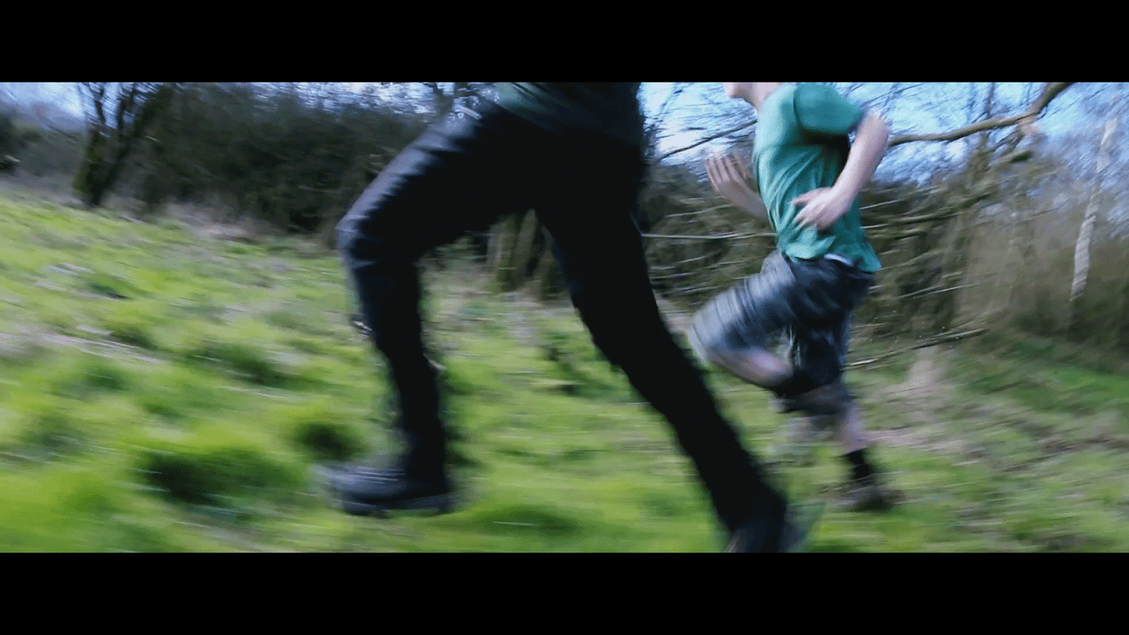
The costumes for the protagonists were green / army camouflage clothing. This made them easy to differentiate between the antagonists. We can also see that one of the protagonists is wearing a camouflage bag which adds to the realism of the film, keeping the audience engaged. The green camo clothing also links to location making it effective as they tie together well whereas is our location for the film an urban setting, we wouldn’t have green camo clothing but more grey/black clothing.
Camerawork and Editing


Throughout
our opening film, we used mostly pace editing near the start to set the speed
of the film and match on action to connote an action film. During action scenes
we used a verity of different camera angles such as close up shot, long shot,
over the shoulder shot and medium shots. These make the action scenes less dull
and boring and keep the audience engages. During production and
post-production, we had to make sure we didn’t break continuity in filming
otherwise the film will seem fake and poorly edited and filmed.
As the start of the opening, we used a ‘call and response’ like feature whereby the film suddenly cuts to black and a credit appears. This allows the audience to know when a credit is going to appear and cutting to black created tension and suspense in the film.
Mid way through the opening scene, we also used the editing technique Shot Reverse Shot to show the exchange of dialogue between the two protagonists. From the two images above, you can see two close up shots of the two protagonists. Using shot reverse shot when two characters are talking is more effective than one long-winded take because it’s less boring to watch.
Match on action is an editing technique commonly used in action, thriller, and adventure films. It captures the scene from different perspectives – all without breaking continuity if it has been done correctly. We used match on action during all our shooting / action scenes.
In post production, when it came to editing our film, we changed the colour scheme of the film to make it more conventional to an action and thriller film. These film genres typically have a dark teal / blue / green colour scheme. The setting is usually a bit dark to connote mystery so in Sony Vegas Pro, our editing programme, we colour corrected and graded our film to give it that conventional look. Changing the colour scheme makes the film more believable and therefore making it more appealing towards the target audience.
In editing, we used made the film more cinematic by using an aspect ratio of 2:35:1 or 2.39.1, for a widescreen viewing experience. A widescreen aspect ratio is used in nearly every film today like ours. Older aspect ratios like 4:3 are rarely used and others like 16:10 and 16:9 are used less in movies but more in documentaries and Television. Our widescreen aspect ratio gives a greater field of view, adding more visual fidelity in each shot of the film and making it more pleasurable for the audience to watch. It also helps immerse the audience into the film where as a smaller aspect ratio is less pleasing.
Title Font and Style


Throughout our opening, we kept our fonts, animation style and positioning as consistence as possible. For all our credits, we used the font ‘DINPro-Regular’ and made it a bold white and all uppercase to make it pop out. All of these credits were faded in from black and then faded out to black. We felt consist text / credits is very in any film because it doesn’t confuse or disrupt the viewing experience for the audience. If the text changes from one font design to another, that audience may become confused, as they may interpret it as something else. Within out credits, we made the font size of the name bigger than the text besides it. For example, in the images above, the name ‘Whitehorn Productions’ is made bigger than ‘Present’. We positioned all the credits in the bottom left of the screen to keep it consistence and is makes it easier to look out for the next credits.
The font we used for the film title, The Alliance, is Poplar Std. From our research and planning (shonamshahig321.blogspot.co.uk/2016/01/font-titles-research-planning.html ) we had a multitude of different fonts to choose from but Poplar was the most popular among our target audience, and it was also the biggest and the boldest making it stand out the most. We also edited the font in Adobe Photoshop to give it a scratched / worn out look.
Genre and how the opening suggests it


Our film opening contains many genre indicators that suggest an action and thriller film. Some genre indicators in our films include prop guns, the costume of the protagonists and antagonists, the death of a protagonist and the use of editing. The pace editing also shows that this is an action because of its fast cuts and transitions between different action.
Visual Effects / Special Effects


Before
After
The use of visual effects and technology is one of our strongest features in our opening film. From all the images above, they show that we have used many different visual effects to make our film more realistic and conforming to the action and thriller genre. All of these effects were created using professional grade programs such as Adobe After Effects, Cinema 4D and Adobe Photoshop. When analysing different shooting scenes from lots of different movies, we noticed that all the muzzle flashes on every gun shot were huge and bright – illuminating up much of the scene. We tried achieving the same effect with the big muzzle flashes.
The before and after images of the sniper was created using Adobe After Effects, Photoshop and Cinema 4D. Since we didn’t have an actual physical sniper to use, we used Computer-Generated Imagery (CGI) to put a large sniper rifle in the hands of the antagonist. By using the 3D camera tracker within After Effects, we were able to track the footage and import it into Cinema 4D. There, we created a model sniper and the tracked footage made sure that the camera position for the forage and the sniper were the same. The big gun is appealing to our target audience as it show them that there are different interesting weapons in the film, giving the effect of a bigger budget film.
No comments:
Post a Comment